For the next part of my historical unit I have to do a presentation on a artist/illustrator. I usually hate public speaking but I feel confident about this one because I will be doing on something that interests me (plus its a really small class).
I have chosen Julie Verhoeven as my subject for my presentation. I really love her illustrations because they are inspirational and dramatic. I particularly like her use of ink which is my favourite media to draw in. She has a very definite signature style. Some of her illustrations are quite provocative but are still beautiful pieces of art work.
 |
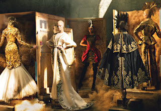
| Les Quatre Elément. Numero, May 2002 |
She is both a fashion designer and illustrator. She grew up in a creative environment because her mum was a illustrator and her dad was a graphic designer. These are were her early influences come from. One of her major influences is music. "I listen and visualise"- Julie Verhoeven. She has named shows after the titles of songs and created illusrations for album covers.
Verhoeven describes her work as "messy, spontaneous, unpredictable and jolly". I would agree I can see all these elements her illustrations. My favourite one is "Help Yourself and God Will Help You". I love how she has linked the drawings together and again her use of ink. You can clearly see the influence of music in the drawing. This is shown through the drawing of the keyboard and the music notes in the illustration. The illustration looks layered and busy because she has used different media. I was unable to get a picture of this illustration but I will try again at a later date.
 |
| Les Quatre Elément. Numero, May 2002 |
Verhoeven has collaborated with global brands including, Louis Vuitton, Versace, Mulbury and H&M. She also has her ownfashion label, Gibo by Julie Vehoeven.
Julie Verhoeven's fashion designs are very much like her illusrations; bold and inspiring. By looking at these pictures it looks as though she has incorparate her illustrations into her designs.
 |
| Mulberry. Autumn/Winter 2007 |
 |
| GIBO, Spring / Summer 2003. |