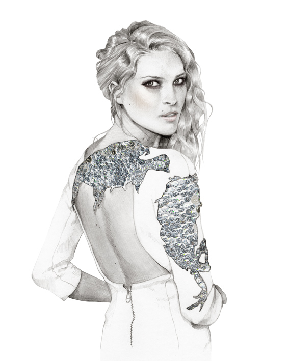
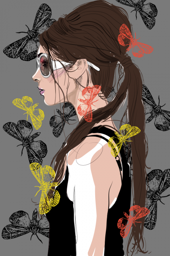
For the current brief I have to create two sets of illustrations. I made a set of couture illustrations and a set of high street illustrations.
I am really pleased with how they turned out. I think they meet a couture market because they are very detailed and the figures look elegant.
These work well for a set of high street illustrations because they appeal to a younger audience and they feature clothes that would be seen on the high street.
SpeechlessInk and Tea with Alcohol and Graphite on Watercolour Paper
Artist Carne Griffiths created these beautifully messy portraits and featured them in his new show "Invisible Lines". He creates his illustrations with conventional materials like calligraphy ink and graphite but he also drips herbal tea and alcohol on to them.
In an interview , Griffiths describes why he began working with drinkable liquids. "I had always worked with calligraphy ink and water. It was a glass of brandy that led to the first splash of drinkables on the page, and, like most things I do concerning artwork, it was a chance happening rather than a planned one. Alcohol has a curious effect on ink, taking the colour deep into the paper very quickly - it behaves very differently to water and gives permanence to some inks."
Unveil Ink and Tea with Alcohol and Graphite on Watercolour Paper Refraction Ink and Tea with Alcohol and Graphite on Watercolour Paper Immersed Ink and Tea with Alcohol and Graphite on Watercolour Paper Destroyed/Reborn Ink and Tea with Alcohol and Graphite on Watercolour
Illustration by Geoffry Gertz created in Adobe Illustrator CS6
Photographer Alexander Kholkhlov worked with makeup artist Valeriya Kutsan and retouching expert Veronica Ershova to capture men and women has surrealist versions of themselves. Their inspiration was pop art, posters, paintings, pixelated images and cartoon characters.
Tal Peleg uses eyeshadow and eyeliner to create these amazing mini paintings on eyelids. Peleg uses the angular shape of the eyebrows to frame her work. In one of the illustrations
she uses the eyebrow as the hair and she even uses the eye in the one above. The eye is used as the pea in "The Princess and the Pea" themed painting.
For this new brief I have to try different illustrating techniques. I looked at the illustrators I researched and practised using their techniques for illustrating. I think the charcoal and paint work the best and will experiment further with these medias.
Lucid Stead is an architectural installation by artist Phillip K. Smith III. He took an existing structure in the desert of Joshua Tree, California and attached mirrors, LED lights and custom built technology to accentuate the beauty of the bare landscapes. He transformed a 70 year old shack that was weathered and worn in to this beautiful and interesting piece of art. In the daylight it looks like parts of the shack is missing and the other pieces are floating in mid-air.
He hasn't altered the shack's structure in any way, the windows and doors are exactly how he found them. He simple builds upon what is already there.
Smith says, "Lucid Stead is about tapping into the quiet and the pace of change of the desert. When you slow down and align yourself with the desert, the project begins to unfold before you. It reveals that it is about light and shadow, reflected light, projected light, and change."
Here is a video of the artist explaining his concept:
In the last brief I had to create a spec drawing for my design, which you can see if you look at my previous blog post. while creating my spec drawing I learnt how to create a fabric swatch. This allows me to convey the fabric I use in my designs.
This is what I used to help me. It is from the "Creative Bloq" website, which has loads of useful step by step guides for CS6.
Step 1
First open the objects that are used for the base of the pattern, then go to Object>Pattern>Make. This puts Illustrator into a new Pattern Creation mode and opens up the Pattern Options panel. The original object is still there, but with copies that give a preview of the pattern.
Step 2
Dim copies to see the original artwork more clearly, and get ready to add some elements to the pattern. You still have access to all the transformation tools in this mode, so you can copy objects and change the colours until you are happy. You’ll notice that the parts of the object that extend outside of the tile automatically wrap back in on the other side.
Step 3
When you are happy with the pattern, turn off Dimmed Copies to get a quick preview of how the pattern will look. When you are happy, you just need to click Save a Copy and name the swatch to see it added to the Swatches panel.
Step 4
Try out the pattern on some blank product examples to see if you are happy with the way it looks. If at any time you want to make any changes, just double click on the swatch in the Swatches panel and this will bring you back into the Pattern Editing mode.
Step 5
Everything in the pattern can still be edited. You can add objects, change their colours, size and position or create new objects. To apply the changes click Done, and this will automatically change the swatch and bring you back to your page and out of Pattern Editing mode.


.jpg)
.jpg)
.jpg)
.jpg)
.jpg)