Thursday, 20 December 2012

Sashiko workshop


As part of this textile brief, I have to take part in textile workshops. The first one is a Sashiko workshop. Sashiko is a Japanese word for "little stabs". As I am new to this technique I did simple patterns which I took from my observational drawings I did.  I really enjoyed this workshop and think Sashiko is a really easy way to decorate fabric.
I used the pattern of the brick Wall to create this Sashiko.
I recreated the shape of the dress.


Wednesday, 19 December 2012

My Final Image


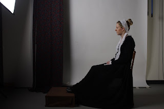
I finally got my image back from the photographer's. I am quite pleased with the outcome. The outfit I created for this worked well it looks very simmilar to the on in the painting. The only thing I would change is the size of the foot stool and the angle the dress drapes away from the chair. If I refined these parts o the image it would be perfect. Overall I think it went well. All I need to do now is hand in this image and my final evalution.

Friday, 14 December 2012

Fred Butler

While researching textile designers I found one I really like. Fred Butler's designs are unusual and wacky which is why I like them. They are innovative. I especially like her use of bright colours. The shapes she creates are very eye catching. They look contemporary. Butler was commissioned to create Lady Gaga's telephone head piece which you will see below.


She creates wearable sculptures. I find her work inspirational. I would like to take elements of her work an incorporate it in to my own.


New Brief

I started a new brief today. For the first task I have to research into textile designers such as Alison Willoughby, Karen Nicol, Fred butler and Laura McCafferty.  I like Willoughby, Nicol and Butler's work. Nicol's work is very detailed and her textile animals are very life like. I like Willoughby and Butler's work because they both use vibrant colours and eye catching shapes. I am not that keen McCafferty's textile work because find them uninteresting.


Alison Willoughby


Karen Nicol


Fred Butler


Laura McCafferty


Wednesday, 12 December 2012

At the shoot


For the final outcome in this brief I recreated the painting "Whistlers Mother". I used Jen as my model. To create the garment in the image I brought some black fabric and put elastic at the top edge, this created the skirt. To create the top part of the dress I used one of my cardigans and attached lace to to it. I haven't seen the final image with the photographer's editing yet but I am already pleased with how the photo shoot went.

Costume Gallery


This is a horse ridding outfit. I would not of used white fabric to create an outfit like this because from personal experience with horse ridding, your clothes do not stay clean. Especially when you fall of which I have done. 


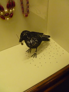
A while back I went to Scotland on holiday. While I was there I visited a costume gallery, I forgot which one, but it was displaying historical fashion. At the time it had a special exhibit of dresses from the 1950s which is my favourite decade for fashion.

Thursday, 6 December 2012

Applying Psychology of Colour to an Album Cover


At the beginning of this styling brief we had to research into the psychology of colour which we had to apply to everything we did in this brief. I am now going to do some independent work by applying the psychology of colour to a album cover. I chose to apply it to Rhianna's Loud album.

The cover is mostly red which is the colour of red. this links to one of her songs called" We found love" Red is a emotionally intense colour which makes the album stand out to buyers. The album is aimed at teenagers which is why I think they made it red. Red is the colour that attracts attention the most. This is why red cars are popular targets for thieves.